Andromeda AI
Brand identity · Type · Art direction

Andromeda AI
Brand identity · Type · Art direction
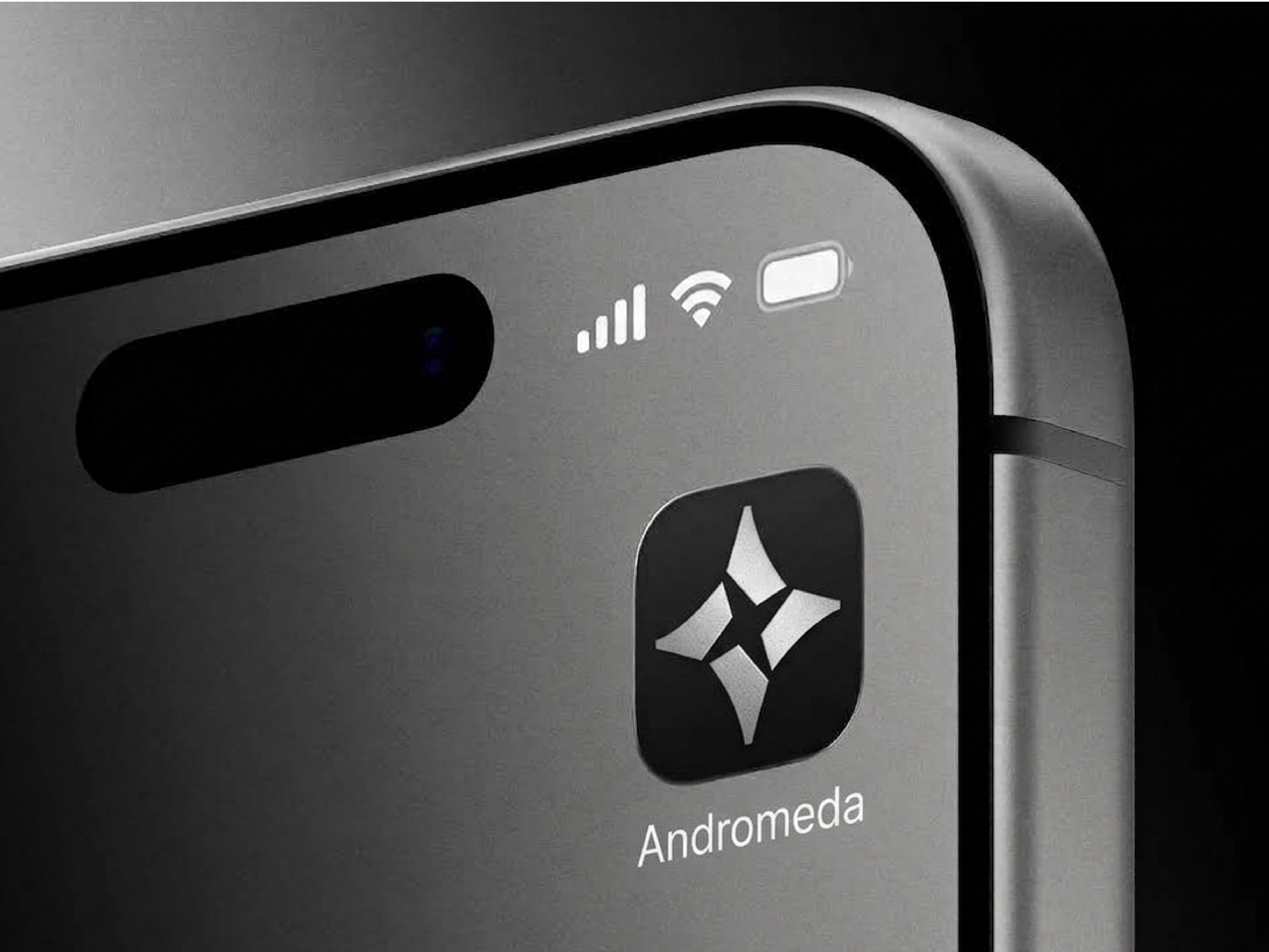
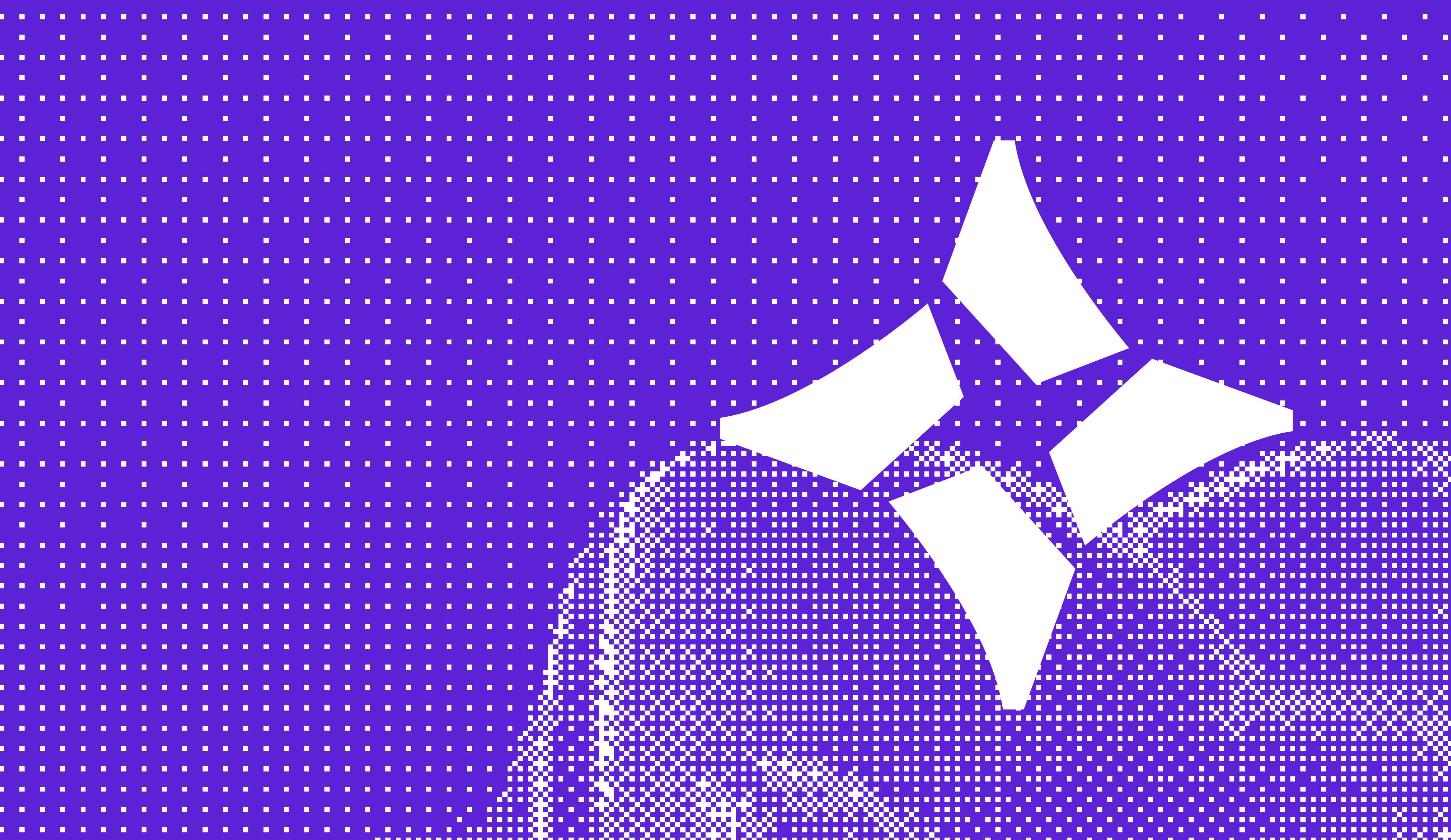
Andromeda AI is a bespoke AI automation studio I co-founded, where I design both the client-facing products we build and the brand and website that represent the studio itself. I built the identity around the Andromeda name itself, using one saturated violet (#5D22D6), a halftone dot texture standing in for stellar dust, and a sharp four-point sparkle mark paired with Cabinet Grotesk and Erode type to give the brand a bolder, more graphic feel.
| Andromeda AI | Case study |
|---|---|
| Role | Brand identity · Type · Art direction |
| Services | Brand identity · Type design · Art direction · Print · Social media |
“We don't believe in one-size-fits-all automation.”
Wordmark lockup, light and dark
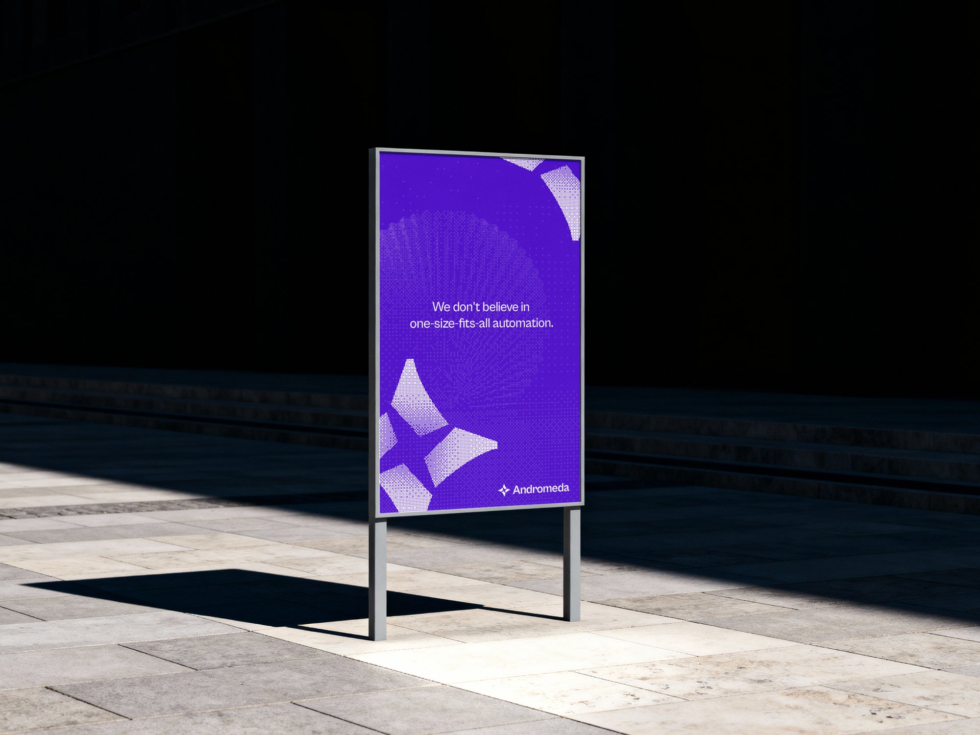
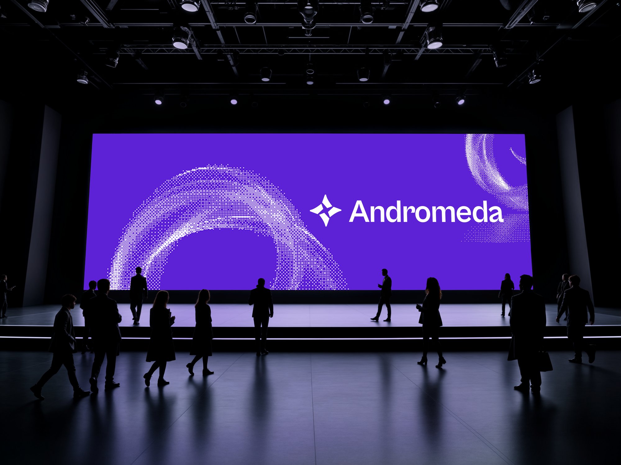
In the wild: a poster and an event screen

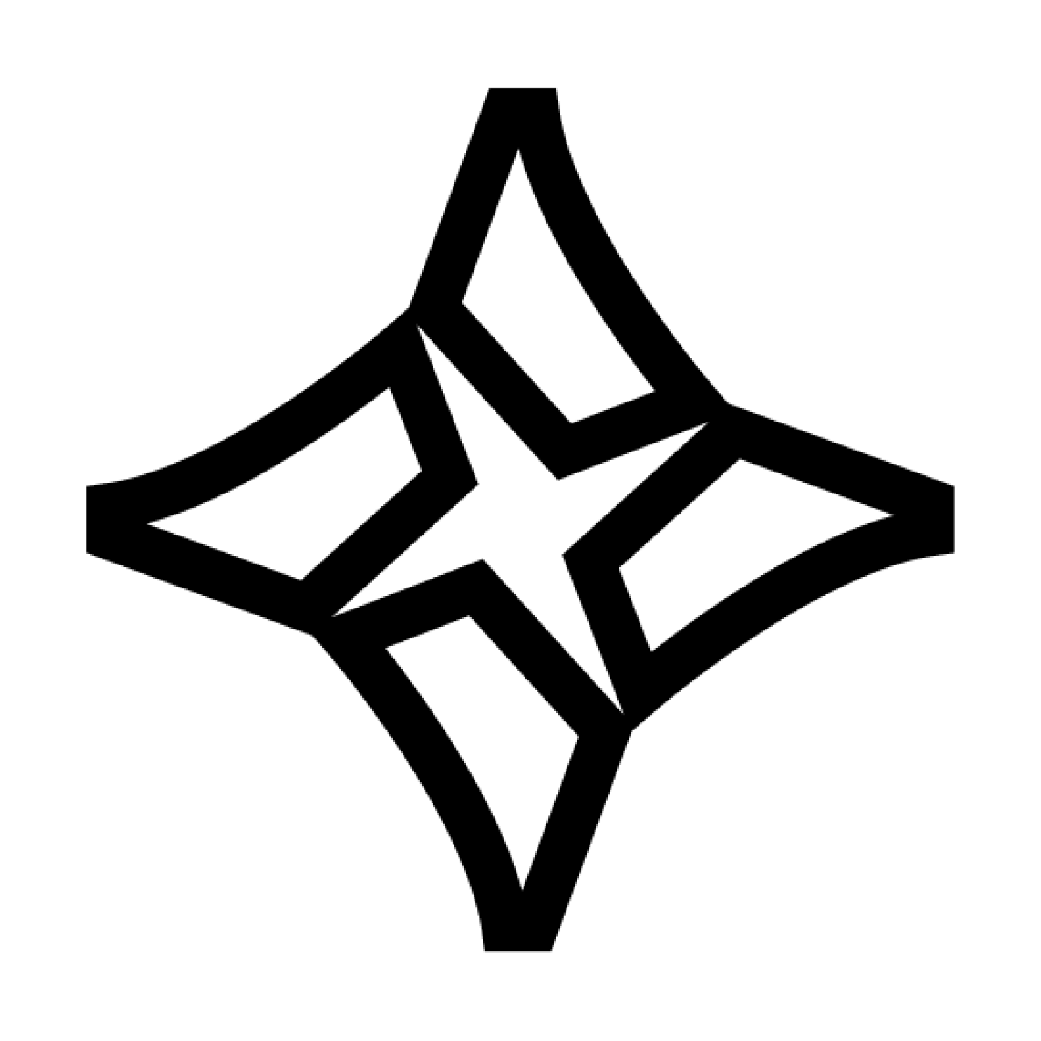

The mark, in every version
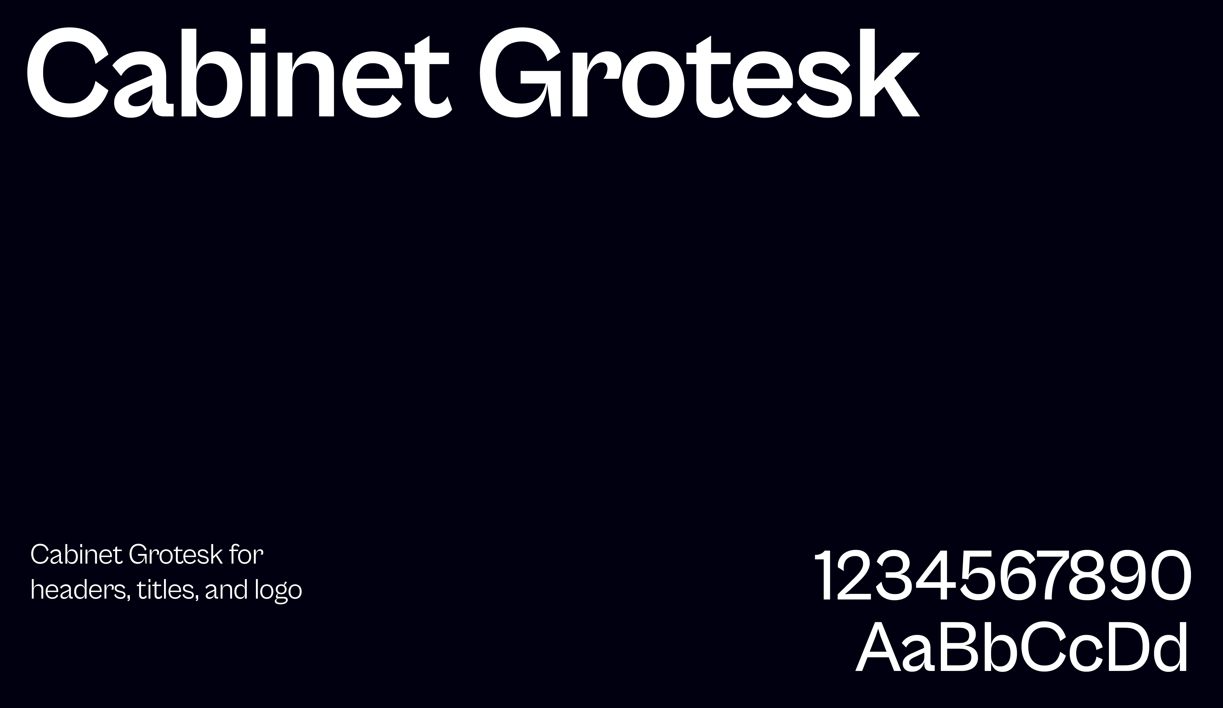
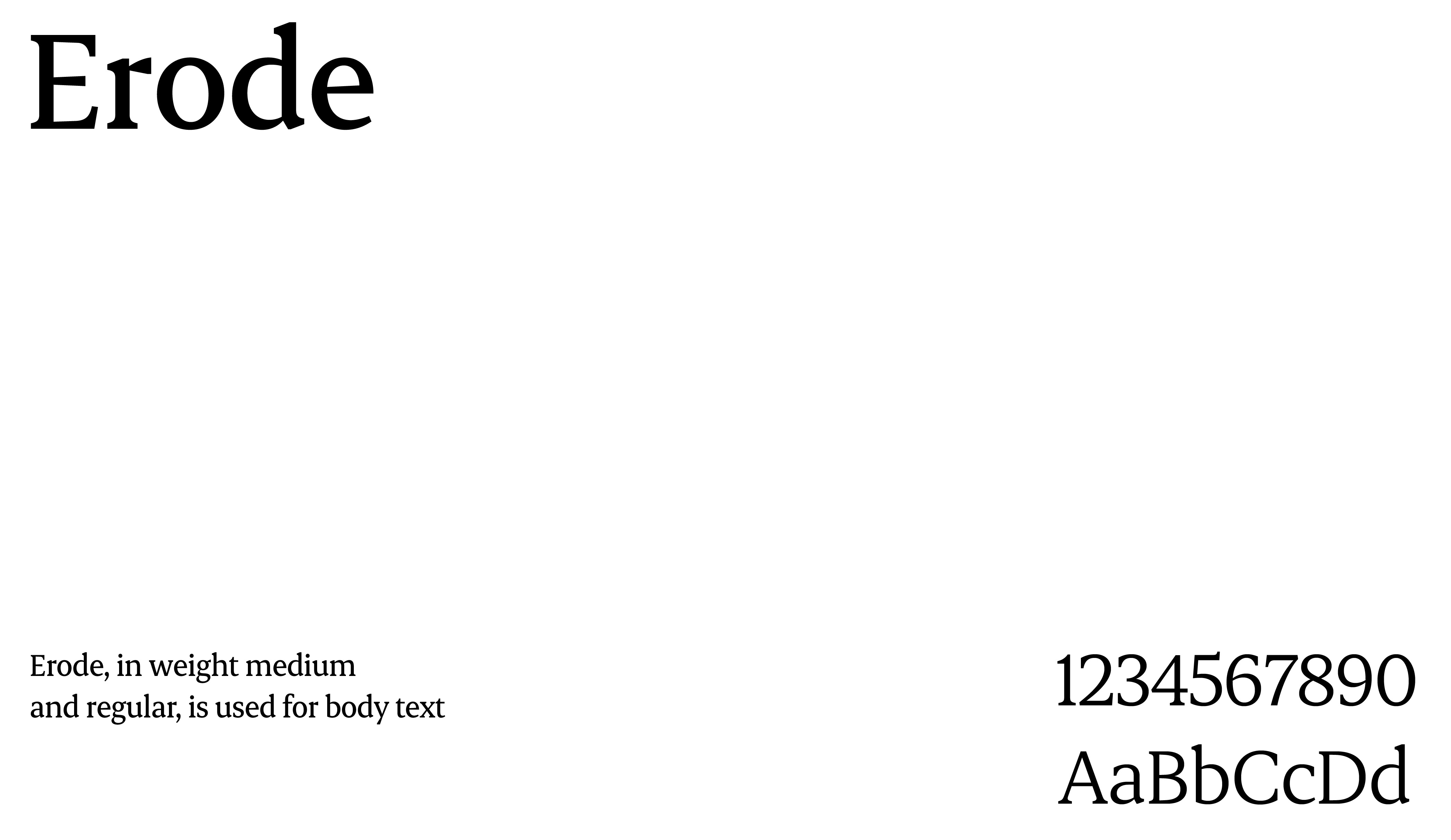
Cabinet Grotesk for display, Erode for text
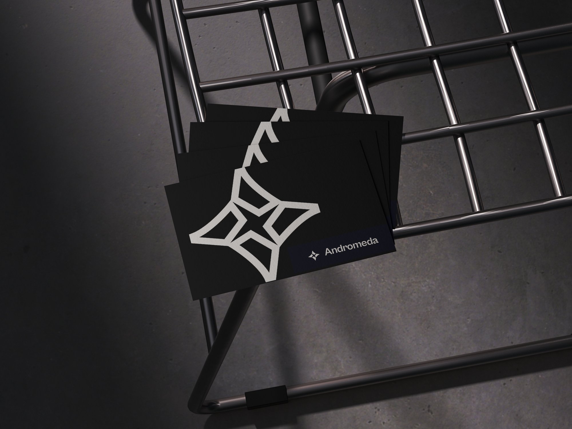
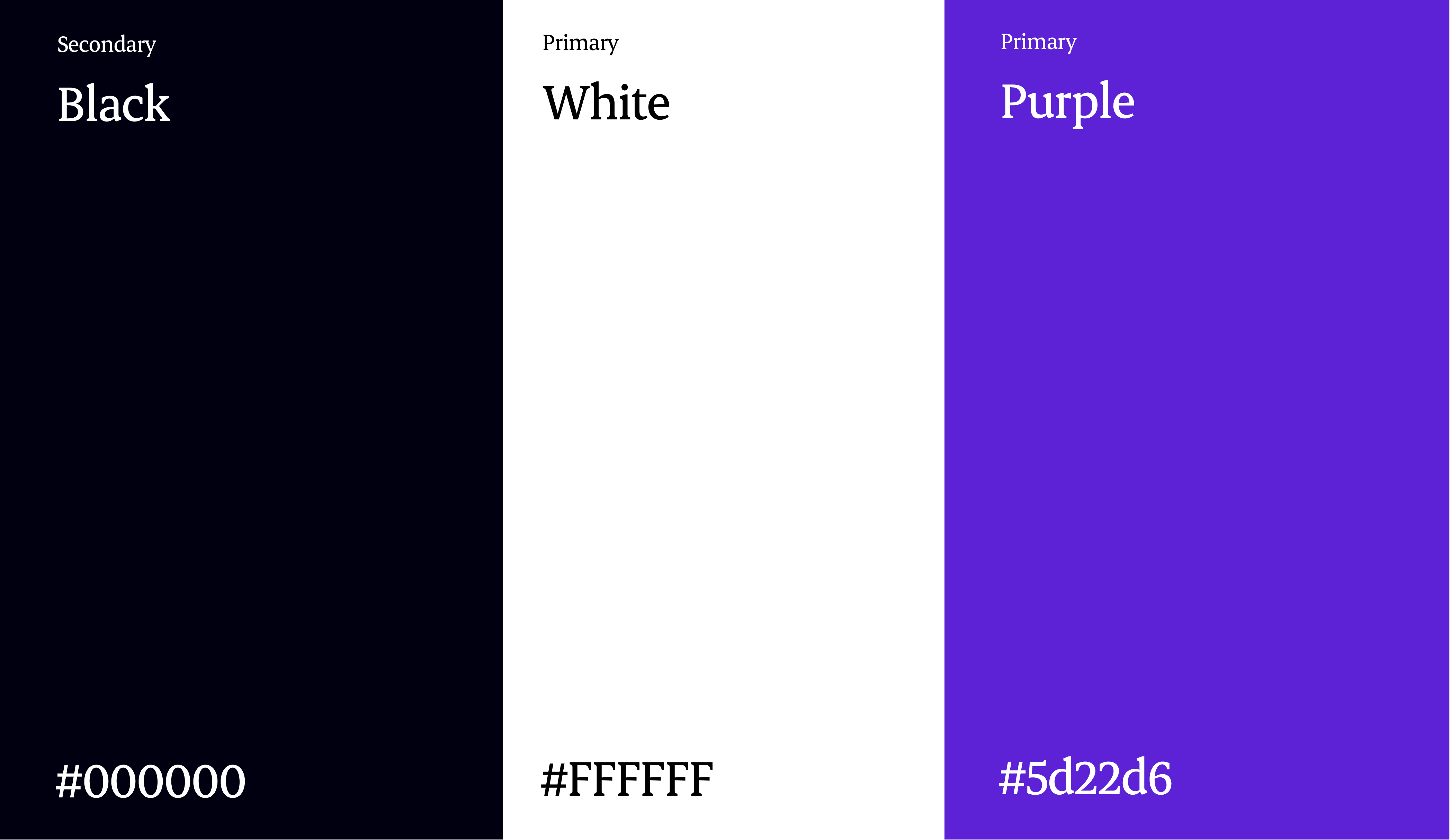
Colour palette
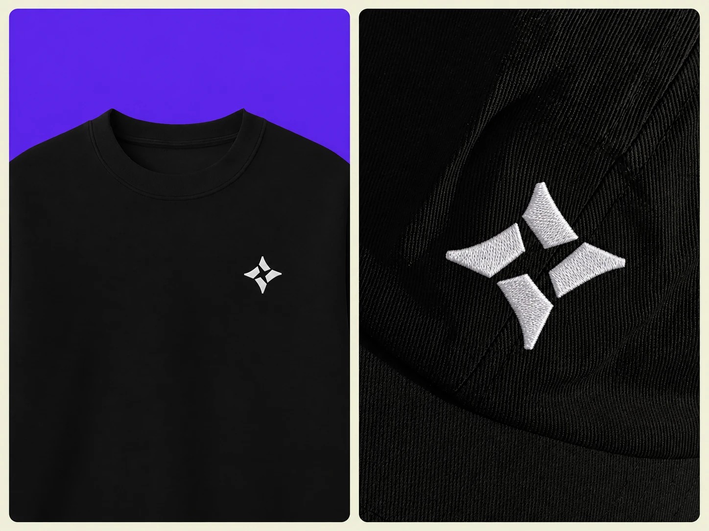
Merch: embroidered tee and cap
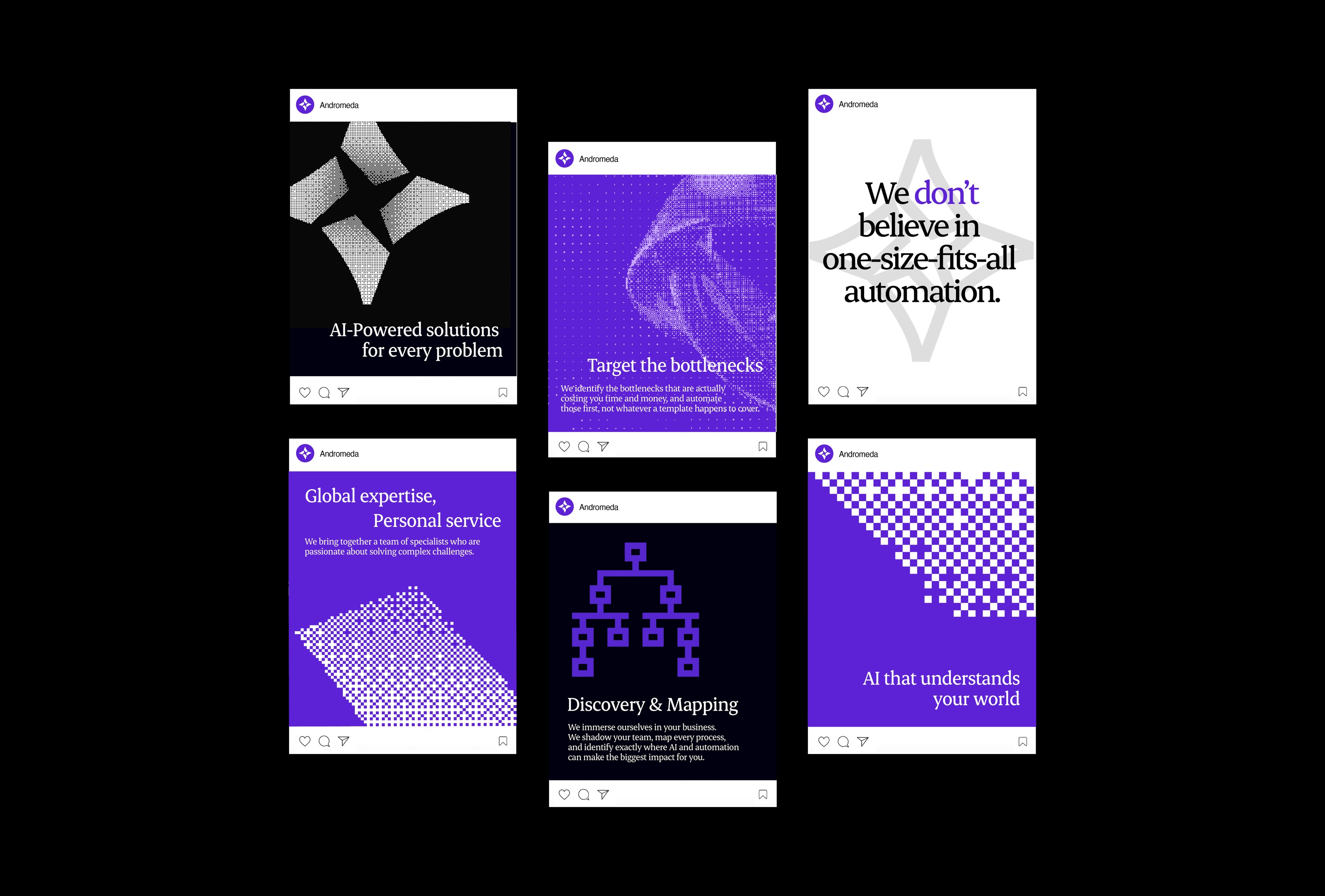
Social media posts
Social tile treatments