Fasila
Type · Conceptual · Publishing

Fasila
Type · Conceptual · Publishing
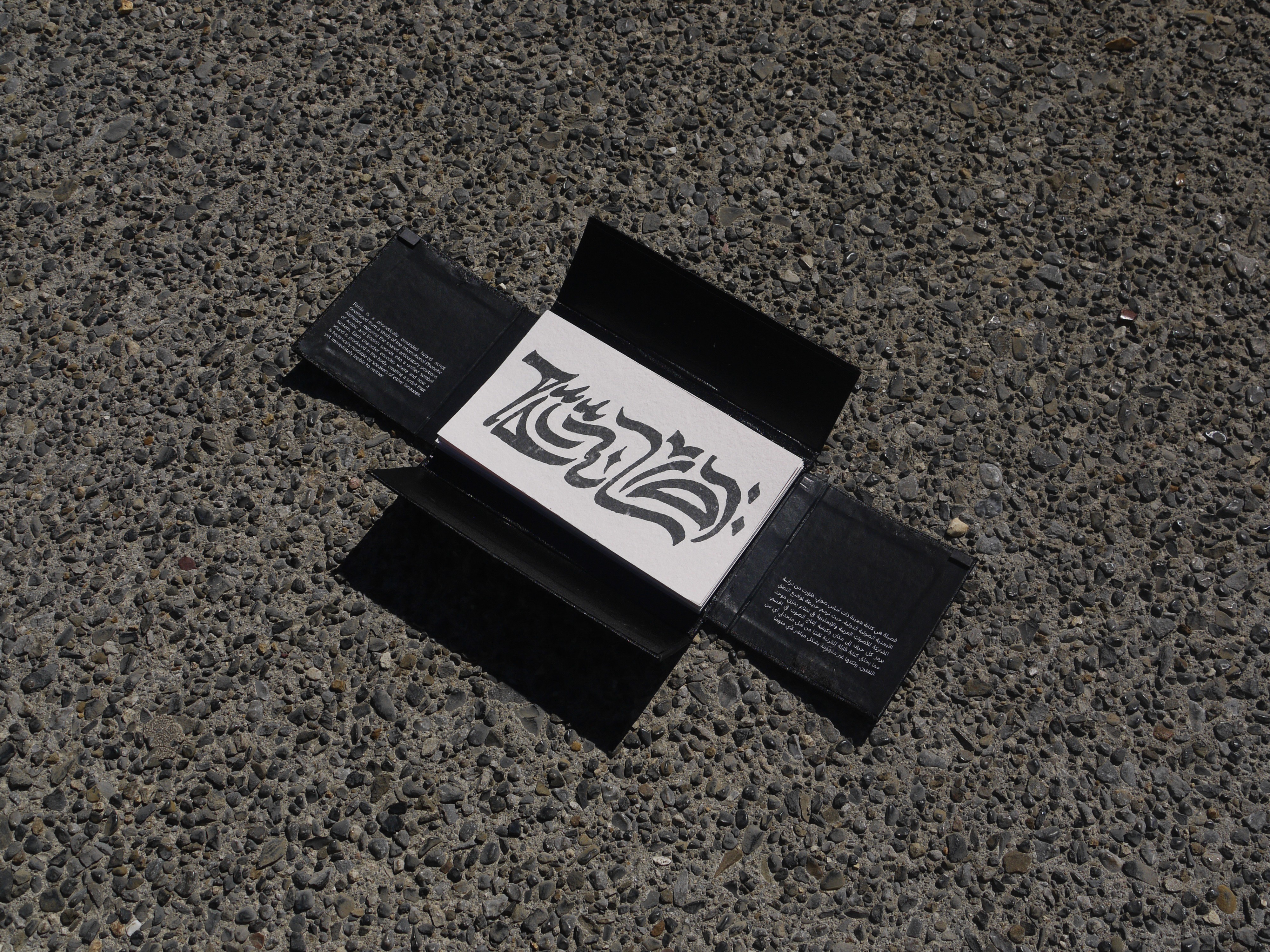
Fasila began with my interest in asemic writing and a personal connection to Arabic's calligraphic tradition, which led me to ask what a writing system built for the space between Arabic and English, rather than despite it, might look like. It's presented as a black cloth box containing a Japanese stab-bound publication documenting the system, alongside a set of loose calligraphic cards showing the script across registers, from precise geometric digital forms to large gestural ink work.
| Fasila | Case study |
|---|---|
| Role | Type · Conceptual · Publishing |
| Services | Type design · Conceptual design · Publishing · Print · Calligraphy |
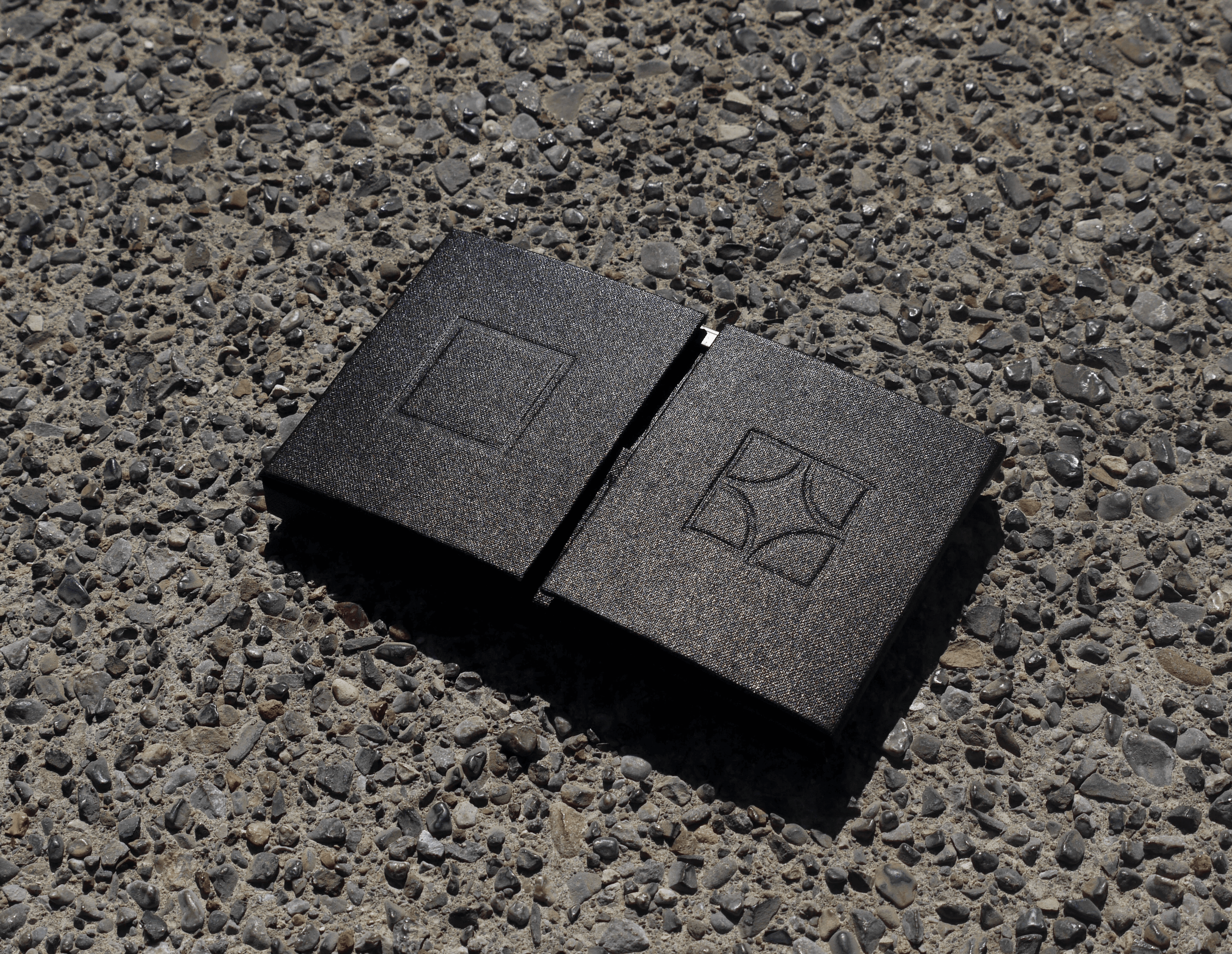
Publication box
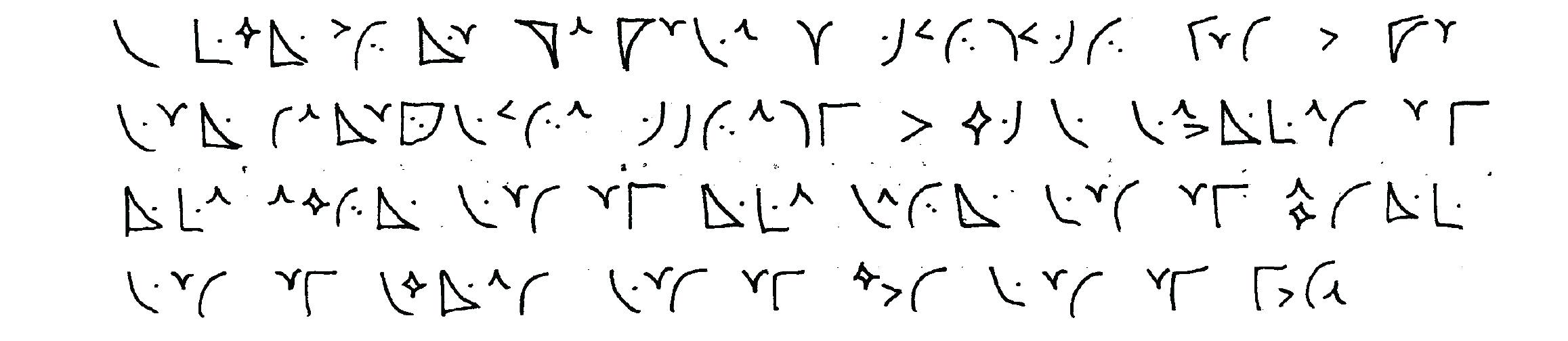
Poem written in Fasila
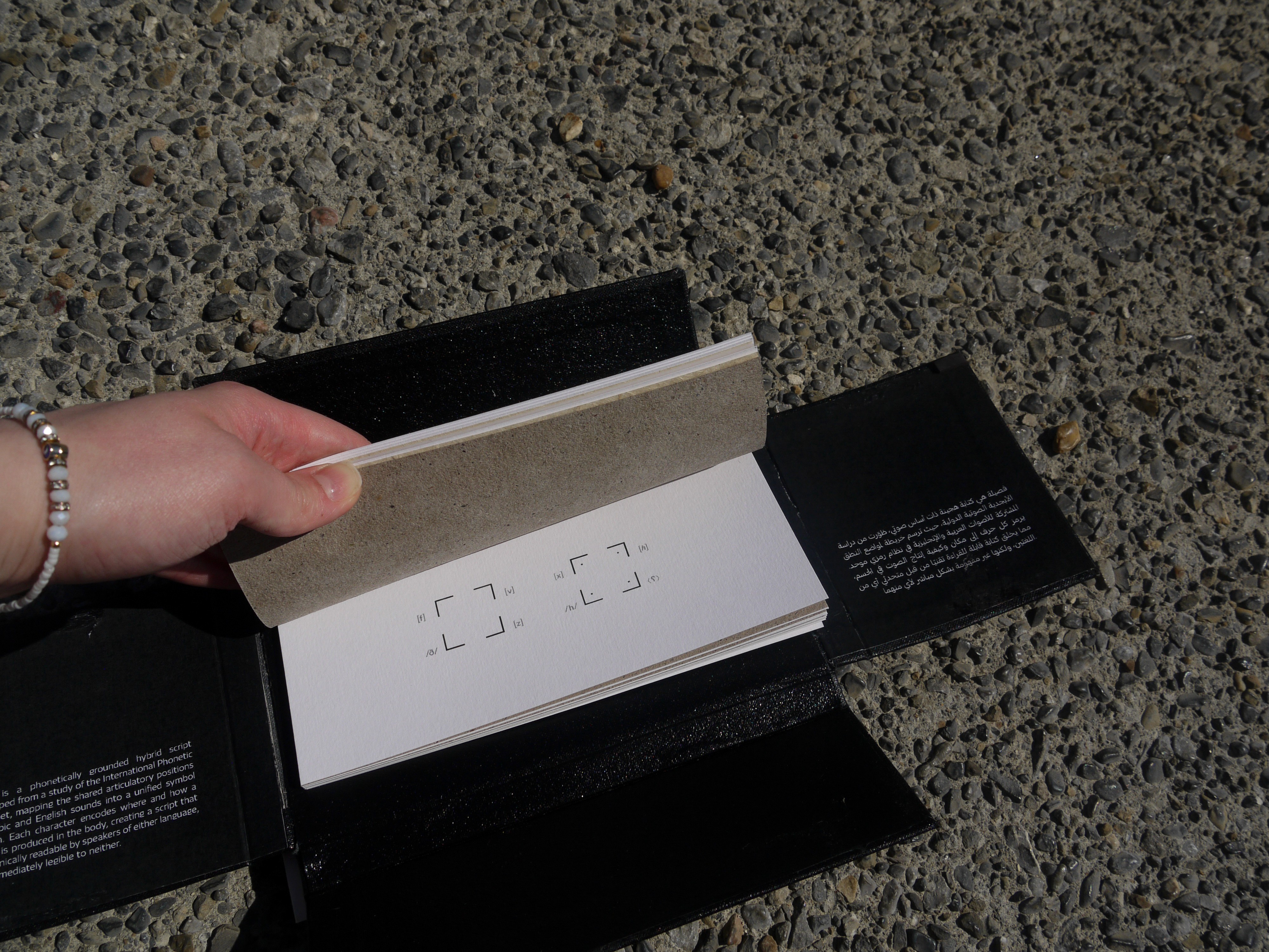
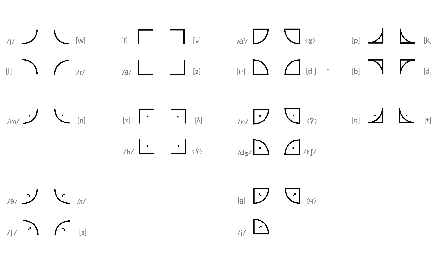
Translation guide - IPA to Fasila
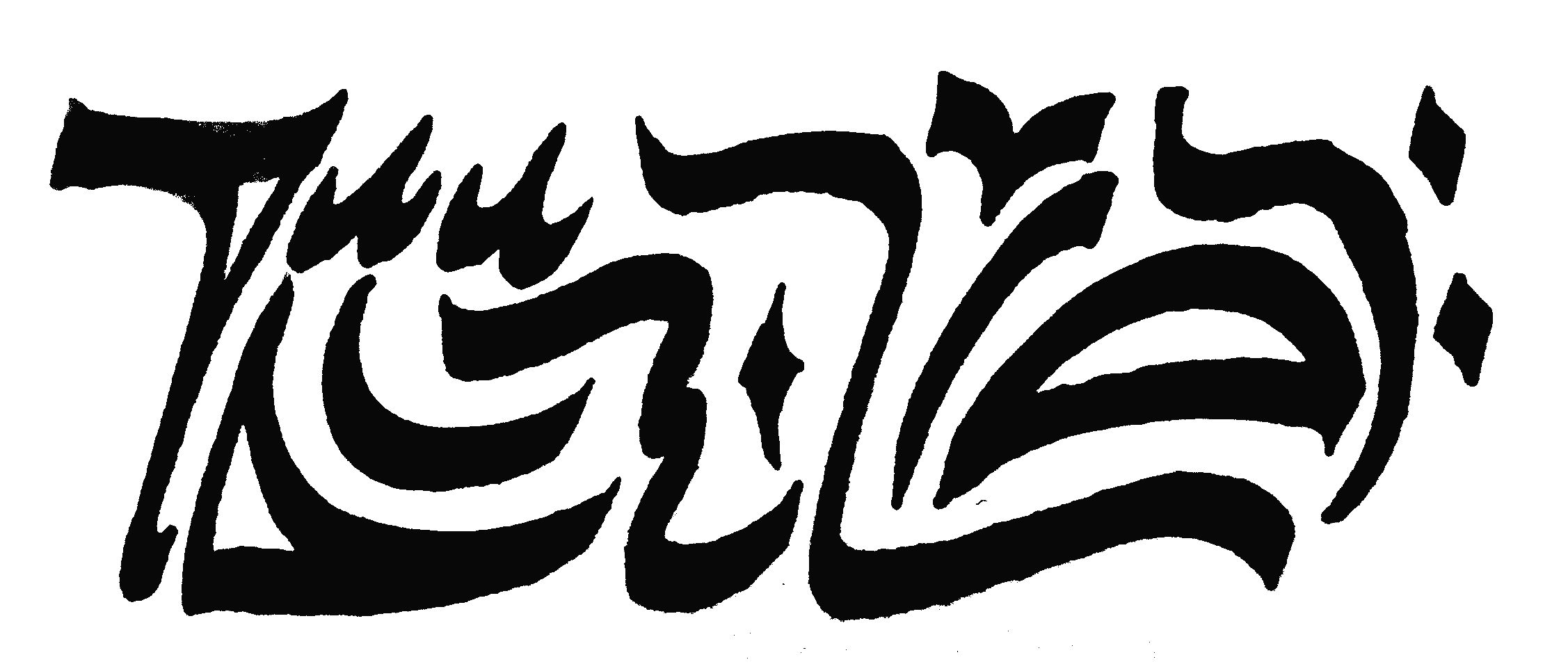
'Between worlds' written in Fasila
Process & experimentation
I started by mapping and analysing a range of existing asemic and constructed scripts, looking at how each balanced structure against illegibility. Alongside this, I built my own IPA chart cross-referencing Arabic and English phonemes, identifying where the two languages share articulation points, which became the phonetic logic underpinning Fasila's letterforms.
From there I iterated the actual shapes through both analogue and digital methods, testing gestural ink strokes by hand to find forms with real calligraphic weight, then refining those into precise digital letterforms, moving back and forth between the two until the script held together as one coherent system rather than two competing styles.
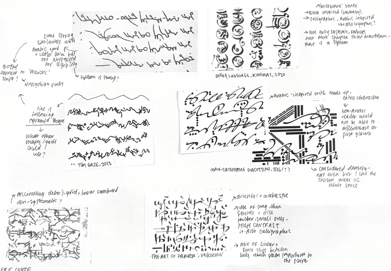
Analysing asemic scripts
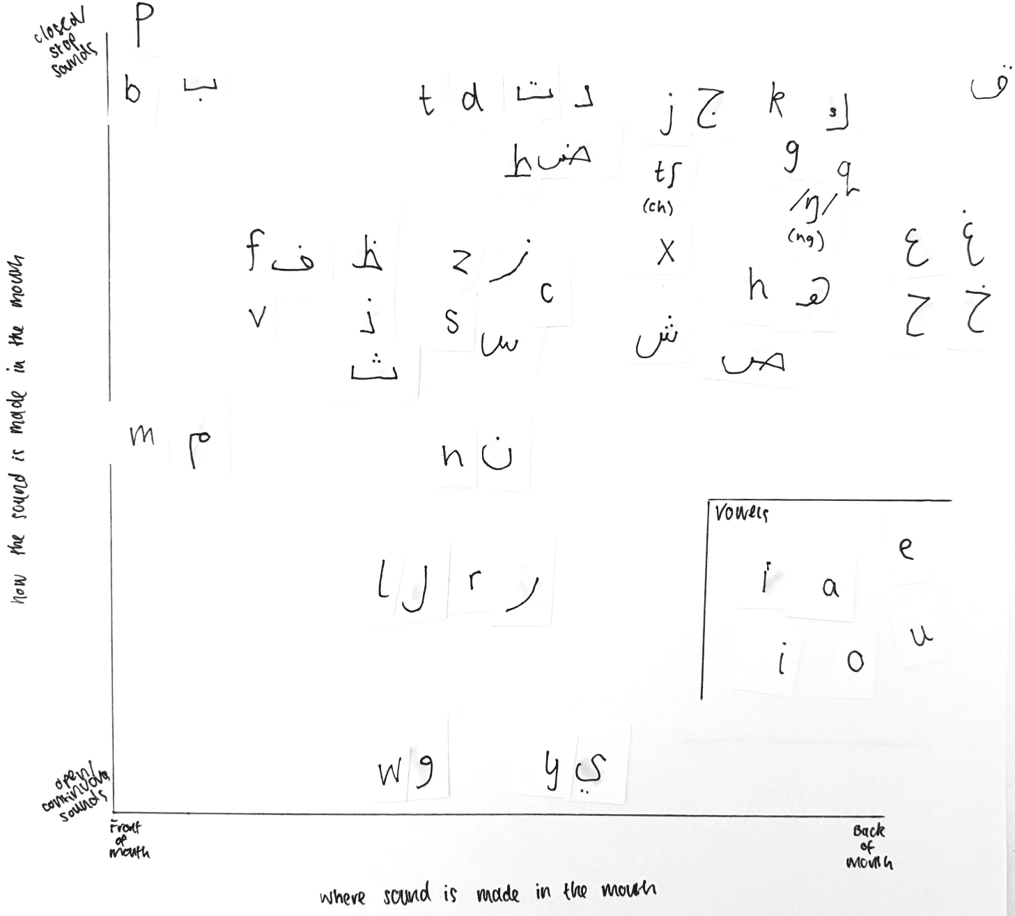
Mapping Arabic & English sounds
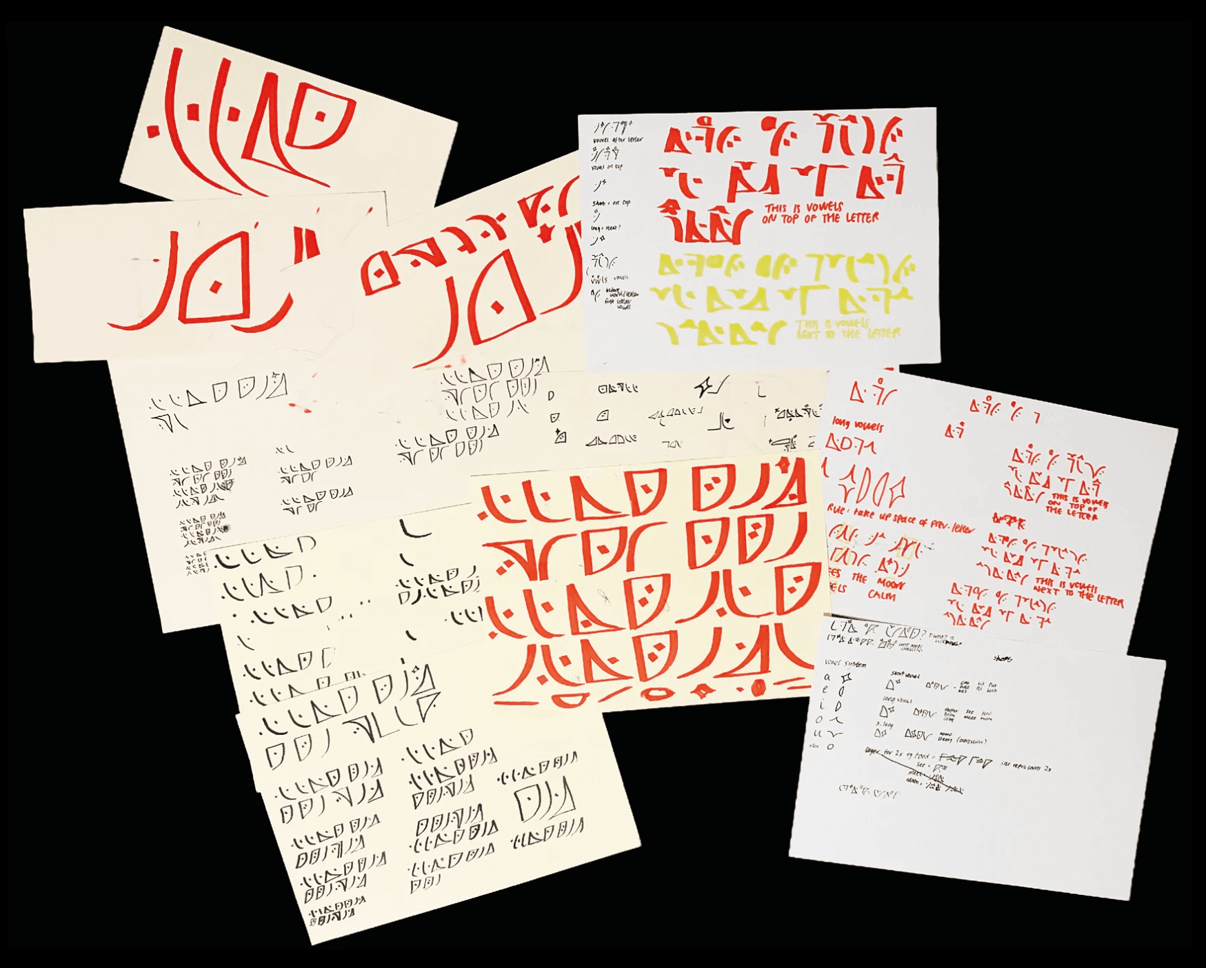
Script development